My personal website is my home on the web.
I made this site because I want to have an online presence, but I didn’t want to use social media or a premade blogging platform (e.g. Blogger , Tumblr , or Bearblog ).
I decided that it would be more interesting to start from scratch, so I designed, built, and published a site of my own.
Build
This site uses Hugo to render my Markdown content to my HTML templates. I also use Hugo for things like asset minification and Sass transpiling. I love Hugo because it’s feature-rich, extremely fast (it takes less than a tenth of a second for a full build), and does exactly what I want it to.
Build History
At the start, this site didn’t have any build step, and I wrote every line of HTML, CSS, and JavaScript by hand. This approach was extremely tedious, so I only wrote a few posts like this.
On June 6, 2025, I switched to build.py , a custom SSG I wrote in Python. Build.py was an acceptable solution, but it was slow, complex, and was very limited in what it could do. I eventually solved this on July 10 by switching to Hugo .
Hosting

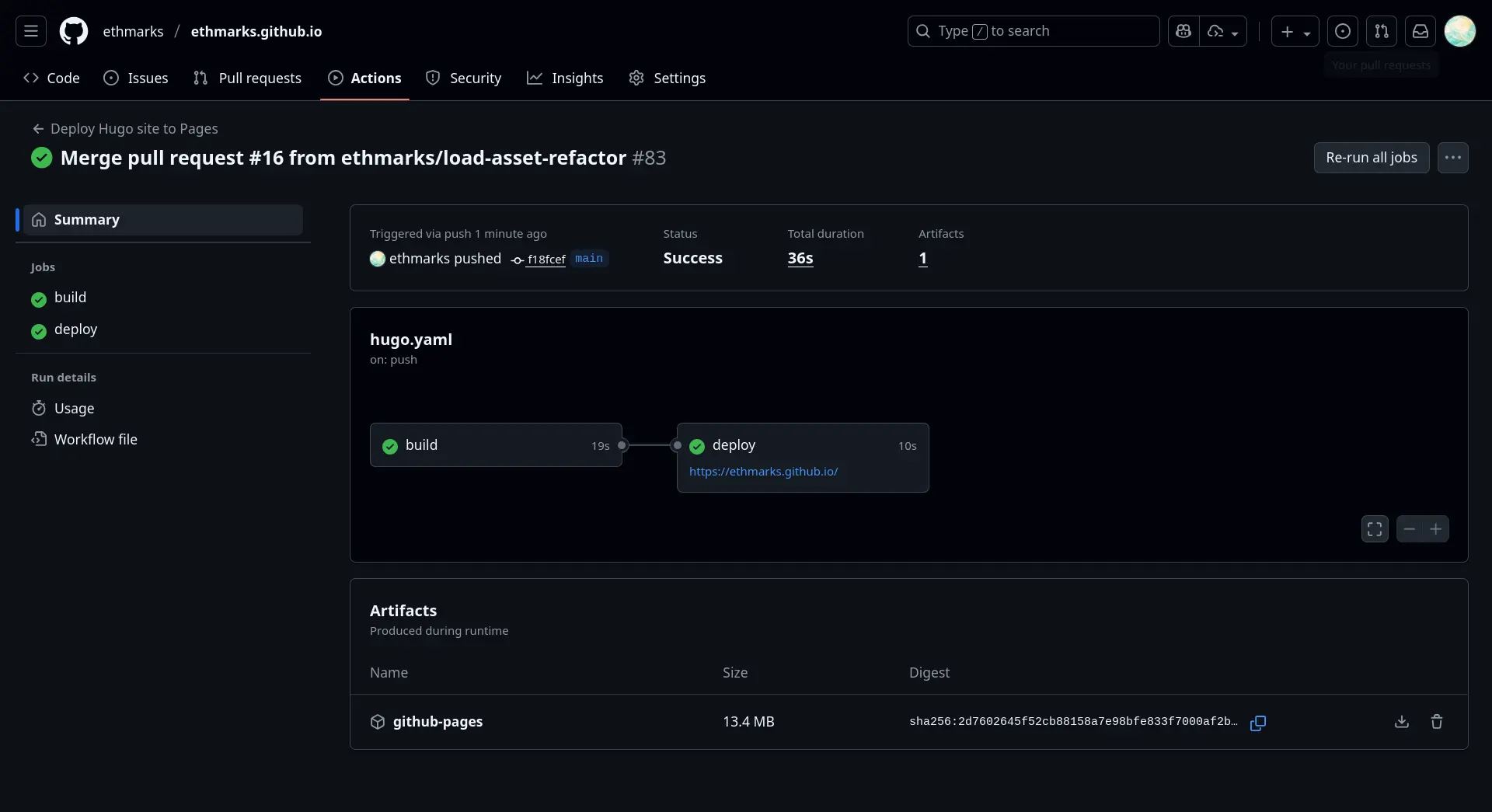
To host the site on the World Wide Web, I use GitHub Pages. This is why the site url includes “.github.io”. Every time I push new code, GitHub automatically redeploys this site. The main reason I’m using GitHub Pages is convenient: I’m already using GitHub for source control, so it was easy to just add a GitHub Action to deploy the site . My second choice would probably have been Neocities for hosting.
Styling
My site has a very specific aesthetic that I find quite pleasing. The aesthetic is the culmination of my spearmint colour palette, modern typography, and careful use of effects, all brought together with thousands of lines of Sass code.
Sass
This site is styled with Sass, a CSS preprocessor that adds useful features to CSS, like mixins, variables, and build-time imports.
This site’s Sass is transpiled using LibSass. LibSass is an old Sass transpiler that’s been deprecated since 2020. The only reason I use LibSass is that I was having trouble setting Hugo up with Dart Sass (the modern and recommended transpiler), because it kept causing timeout errors that were inconsistent and very difficult to debug. I eventually just gave up and switched to LibSass. This means that I can’t use any of the new Dart Sass features like @use, so I use @import instead.
Every page layout has its own Sass file that imports the modules that page needs. For example, here’s the annotated Sass file for my posts page .
 1/* Import global styles used by every page */
 2/* This includes things like fonts, the header, and the backdrop */
 3@import 'global';
 4
 5/* Import the post-link component */
 6@import 'components/post-link';
 7
 8/* Import the post-tag component */
 9@import 'components/post-tags';
10
11/* Import the random post button component */
12@import 'components/random-post-btn';
These Sass files are then transpiled into normal CSS and imported into the page using some custom partials I wrote that take a file name as an input and automatically minifies and transpiles the asset, and then generates the HTML import for that file. For example, here’s the code at the top of the posts index page .
1{{ partial "css.html" "posts.scss" }}
2{{ partial "js.html" "components/randompost.js" }}
And here’s the HTML that the partial generates. Note that it transpiled the SCSS into CSS, minified both assets, and added defer to the script.
1<link rel="stylesheet" href="/css/posts.min.css" />
2<script src="/js/components/randompost.min.js" defer></script>
Responsive Design
This site looks different depending on the size and dimensions of the screen used to view it. For example, the header is a floating capsule on desktop, but takes up the whole width of the screen on mobile. Likewise, hover effects and mouse interactivity are disabled if you don’t have a cursor (for example, on a mobile device).
Colour Palette
This site uses a dark theme with a spearmint teal accent colour.
- Primary: #ffffff: White
- Backdrop: #121212: Black
- Accent: #8fdfd4: Spearmint Teal
Typography
I self-host this site’s fonts using variable woff2 files. Variable fonts significantly cut down on the file size, allowing the site to load faster. I sourced the fonts from the Variable Font Helper app, which sources them from Google Fonts.
- Primary Font: I use Nunito as the primary font, for its sleek neo-grotesque design and its support for both Latin and Cyrillic glyphs.
- Secondary Font: I use Sen as the font for headings. There are many subtle differences between Sen and Nunito, but the most noticeable is the lack of rounded strokes. Sen looks sharper and more angular than Nunito.
- Monospace Font: I use Fira Code for all monospace text, like code blocks, ASCII art, or inline code spans.
- Display Font: I use Kenia for the “404” numerals on this site’s 404 page .
Special Effects
404 Page Rings: My 404 page features a rotating grid of concentric rings of dots that also reacts to your mouse. I was inspired by GitHub’s 404 page that cheekily says “this is not the web page you’re looking for” with an Octocat dressed as Obi-Wan Kenobi. Getting a 404 on GitHub is always delightful, and I tried to emulate that with my own 404 page by adding a fun visual effect.
Mint Gradient: All <h1> elements have a mint gradient applied to them. This gradient starts off at the standard spearmint teal accent color, and then fades into the standard white text color. This also applies to the title on the left side of my site header. This adds polish and branding.
Header Blur: I love glassmorphic blur effects , so I added a 20 pixel gaussian blur effect to my site header. For performance reasons, the header is the only element on the site that has a significant gaussian blur. When I was first designing this site, I put blurs everywhere, including on the article background. Turns out, this makes the page really, really, really slow. Blurring the header adds polish, and not blurring anything else adds frames per second.
Header Nav Indicator: The nav links in my site header glow when the current page is on their domain. Currently, the “Posts” nav link is glowing because you’re on a post right now. On my About page , the “About” nav link glows. On my Home page , the “Home” nav link glows. On my Projects page , the “Projects” nav link glows. This helps with readability and polish.
Header Birthday Mode: On my birthday (September 13), my site header glows pinkish-orange, the title on the left side strobes between pastel red, cyan, blue, sage, orange, and pink, and the cake and party emojis (🎂🎉) are appended to the title. This helps with “yay its my birthday”.
Home Page Intro Text: When my Home page first loads, the intro text starts off blurred and slightly floating, but then each character blurs and drops into place in sequence. This entrance animation adds polish.
Home Page Profile Picture Click: If you click on my profile picture (the spearmint crystal thing) on my Home page , the intro text expands (by adjusting the letter spacing) and activates several animations. The “Ahoy! I’m” flips 180 degrees in 3D space, the “Ethan Marks” glows and has a subtle 3D tilt, and the “Software Developer” turns teal. I added this because people kept trying to click on my profile picture and being disappointed that nothing happened, so I made something happen. This adds a fun bit of interactivity.
Lighthouse
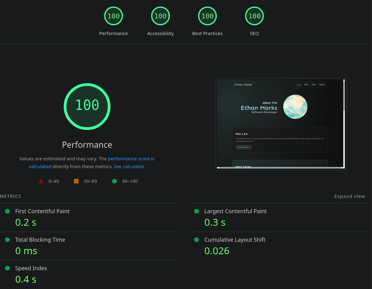
As of August 31, 2025, the site earns a perfect 100 on Lighthouse . Lighthouse is a tool developed by Google that audits web pages for performance and accessibility. A higher score means that the page loads more quickly and is more accessible.
To provide a good user experience, sites should strive to have a good score (90-100). A “perfect” score of 100 is extremely challenging to achieve and not expected. For example, taking a score from 99 to 100 needs about the same amount of metric improvement that would take a 90 to 94.
official Lighthouse documentation
My site’s performance is largely due to it being lightweight and carefully optimized.
- Static Rendering: All of my site’s content is present in the HTML. Unlike some sites that use JSX and client-side rendering to dynamically hydrate their pages using JavaScript, my site render all content at build time. This uses much less processing power on your device and makes the page load much faster.
- Optimized CSS and JS: Each page on my site only loads the resources that it needs, and the resources that it does import are minified. I used custom partials to automate this process slightly, as discussed in the Sass section . This per-page approach minimizes the data that needs to be downloaded and allows the page to load faster.
- Optimized Images and Videos: The images, videos, and animations on my website use the WebP and WebM formats, which allows them to load faster and use less data.
Privacy
This site does not use cookies, trackers, analytics, or any external telemetry tools. This is partially because I care about your privacy, but mostly because I don’t care about your personal information. Your data remains yours because I don’t want it.
Accessibility
This site is designed to be accessible to as many users as possible. I’ve done my best to follow best practices regarding meta tags, semantic markup, keyboard navigation, and alt text.
Authoring
Each post (including the words you’re reading right now) is written in Markdown. I occasionally use custom Hugo shortcodes (inline templates) for things like iframes, but I mostly stick with plain Markdown syntax.
I use the Zed editor for all of my coding and most of my writing, but I write the longer and more heavily-researched posts using Obsidian .
I use Hugo’s live development server to instantly (I’ve never seen it take longer than 100 milliseconds for a rebuild) render the site locally so that I can see the changes I make in real time.
Conclusion
My personal website is one of my favorite projects I’ve ever made. I’ve worked on it for longer than any other project, and I’m still adding new features and learning new things.
I’m proud of my little corner on the web, and I hope you enjoy it as much as I do. Thanks for reading.
~Ethan
